Why the Spending vs Total Royalties graph changes color
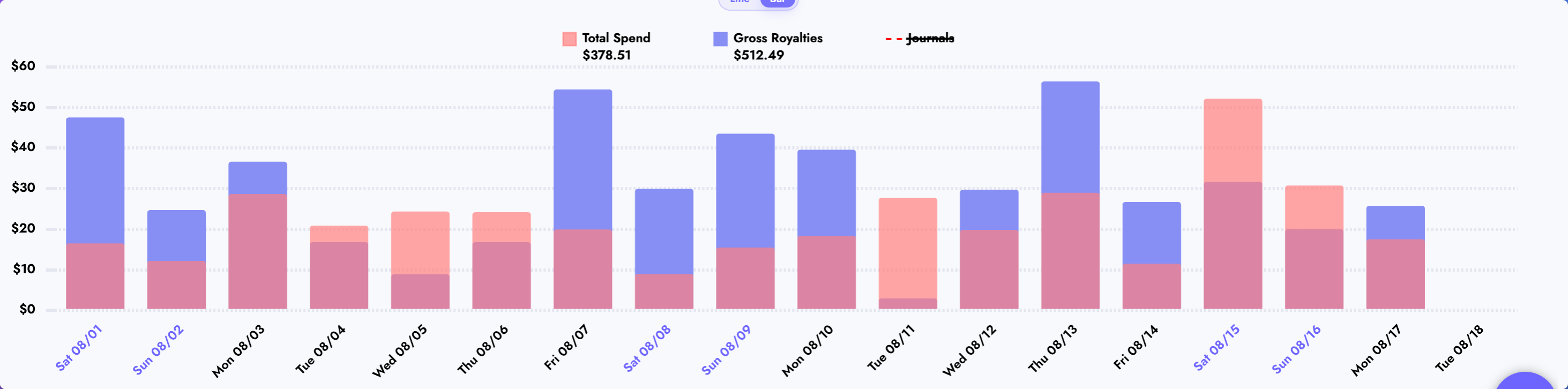
The short answer is: two bars occupy the same space.
- The blue/purple bar is Gross Royalties (sometimes labelled Total Royalties). This is the money earned before spending is deducted.
- The red/pink bar is Total Spend. This includes the advertising spend and external expenses recorded for that day.
- Where the bars cover each other, their colors mix. The overlap looks purple, mauve, or dark pink.
The mixed section does not mean extra royalties, extra spending, profit, or net royalties. It is simply the blue and red bars drawn in the same place.
Read one day at a time
For each date, imagine that Publisher Champ draws two bars from $0 upward:
- One bar stops at that day's Gross Royalties.
- The other stops at that day's Total Spend.
- The shared part changes color because the spending bar is partly transparent.
- If one value is higher, the part above the overlap keeps that value's normal color.
The bars are overlaid, not added on top of one another. Never add the visible sections to calculate the day's value.
If you like formulas, the graph is doing this:
- Height of the mixed section: the smaller of the two values.
- Height of the single-color top: the larger value minus the smaller value.
- Height of the complete bar: whichever value is larger.
You do not need to calculate any of that yourself. Hover over or tap a date to see the exact amounts.
What every color means
| What you see | What it means |
|---|---|
| Blue/purple only | Royalties exist in that section, but spending does not reach that high |
| Red/pink only | Spending exists in that section, but royalties do not reach that high |
| Mixed purple/pink | Both bars cover that amount |
| No bar | Both values are $0, or there is no data for that day |
Your colors may look slightly different if you customized the chart colors. The same overlap rules still apply.
Combination 1: royalties are higher than spending
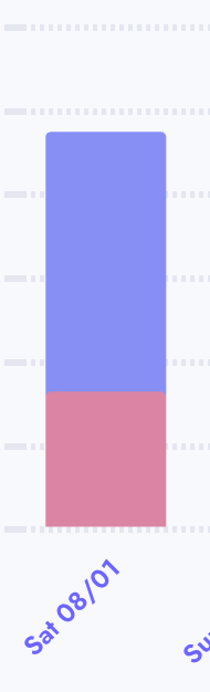
In the example, the bar is mixed from $0 to about $16 because both royalties and spending cover that part. Above about $16, only the blue royalties bar continues, until about $47.
In very simple terms:
- Mixed bottom = money was earned and money was spent.
- Blue top = the amount by which royalties are higher than spending.
- This day has positive net royalties.
Formula: Net Royalties = Gross Royalties − Total Spend
Using the approximate values shown: $47 − $16 = $31 net royalties.
Combination 2: spending is higher than royalties
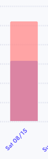
In this example, both bars overlap from $0 to about $31, so that part is mixed. The red spending bar continues alone from about $31 to $52.
In very simple terms:
- Mixed bottom = both values cover that amount.
- Red top = the amount by which spending is higher than royalties.
- This day has negative net royalties (a loss after the recorded spending).
Using the approximate values shown: $31 − $52 = −$21 net royalties.
Royalties are still there. They are visible inside the mixed section. The chart is comparing the two totals, not replacing one with the other.
Combination 3: royalties and spending are equal

If both values are $30, both bars start at $0 and stop at $30. They cover each other completely, so the whole bar can look mixed.
- There is no blue section above the overlap.
- There is no red section above the overlap.
- Net royalties are
$30 − $30 = $0.
This can look like one purple bar, but it is really two equal bars in exactly the same place.
Combination 4: there are royalties but no spending

If royalties are $30 and spending is $0, there is nothing red to overlap the royalties bar. The bar stays blue from $0 to $30.
- Blue bar = $30 Gross Royalties.
- No red bar = $0 Total Spend.
- Net royalties are
$30 − $0 = $30.
Combination 5: there is spending but no royalties

If royalties are $0 and spending is $30, there is nothing blue under the spending bar. The bar stays red from $0 to $30.
- No blue bar = $0 Gross Royalties recorded for that date.
- Red bar = $30 Total Spend.
- Net royalties are
$0 − $30 = −$30.
This can happen when an ad spends money on a day that has no reported royalties. It does not prove that the ad produced no later sales; platform reporting and royalty data can arrive on different schedules.
Combination 6: both values are zero

When both values are $0, no colored bar rises above the baseline. The date can still appear on the horizontal axis.
This means the graph has no Gross Royalties or Total Spend to draw for that date. It does not mean the graph is broken.
Combination 7: the values are very close
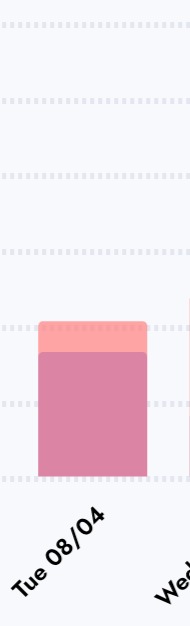
When the values are close, almost the whole bar is mixed and only a thin strip of blue or red remains at the top. That thin strip tells you which value is slightly higher.
- Thin blue top: royalties are slightly higher.
- Thin red top: spending is slightly higher.
- No top strip: the values may be equal, or so close that the difference is hard to see at the current scale.
Hover over or tap the date to read the exact values instead of guessing from a very thin strip.
Why can a bar seem to “change color” halfway up?
It is not one bar changing meaning. It is the point where the shorter bar ends.
For example, if Gross Royalties are $40 and Total Spend is $15:
- From $0 to $15, both bars exist, so you see the mixed color.
- From $15 to $40, only royalties exist, so you see blue.
If the numbers are reversed, the mixed area is still $0 to $15, but the top is red because spending continues to $40.
Why the daily result may look surprising
The graph places royalties and spending on the date reported for each record. Those records do not always move together.
- An ad can spend today while a sale or page-read royalty is reported later.
- Some publishing platforms update royalties on a delay.
- Filters can include or exclude particular books, countries, platforms, or spending records.
- External expenses appear on the dates recorded for them.
- Recent dates can change as new data is imported.
For those reasons, do not use one day's bar alone to decide whether an ad is working. Check a suitable date range and allow delayed data to arrive.
The easiest way to check an exact day
- Select Spending vs Total Royalties in the graph menu.
- Hover over the date on a computer, or tap it on a touch device.
- Read the exact Gross/Total Royalties and Total Spend amounts in the tooltip.
- Subtract Total Spend from Gross Royalties if you want the day's net result.
Gross Royalties − Total Spend = Net Royalties
Quick troubleshooting
“I see purple. Is that profit?”
No. Purple is only the visual overlap of the two bars. Use the subtraction formula to find net royalties.
“Why is red visible only at the top?”
Spending is higher than royalties. The lower part overlaps the royalties bar; the red top is the extra spending above royalties.
“Why is blue visible only at the top?”
Royalties are higher than spending. The blue top is the extra royalties above spending.
“Why is the entire bar mixed?”
The two values are equal or nearly equal, so one bar almost completely covers the other.
“Why do I see only red?”
There is spending for that date but zero royalties, or the royalties are too small to notice at the current scale. Check the tooltip for the exact value.
“Why do I see only blue?”
There are royalties for that date but zero spending, or spending is too small to notice at the current scale. Check the tooltip for the exact value.
“Why is there a date but no bar?”
Both values are zero for that date, or no matching data is available under the current filters.
One rule to remember
Mixed color = overlap. The color left at the top = the larger value.